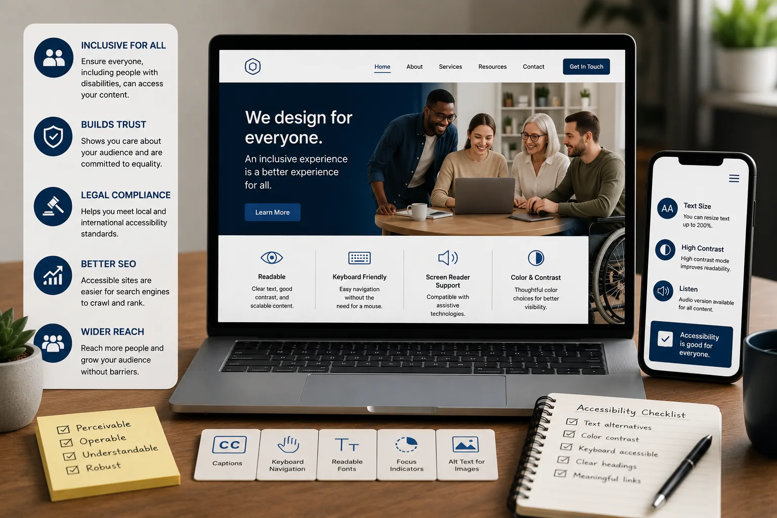
When businesses think about website quality, they usually think about design, speed, and content — accessibility rarely makes the initial checklist. But a website that isn't accessible quietly excludes a meaningful share of potential customers: people with visual, motor, hearing, or cognitive disabilities who rely on assistive technology or specific design accommodations to use the web at all.
Beyond being the right thing to do, accessible design is good business — it expands your reachable audience, improves usability for everyone, and often boosts SEO performance as a side effect. Here's why it matters and how to actually implement it.
What Website Accessibility Actually Means
Website accessibility refers to designing and building a site so that people with disabilities can perceive, understand, navigate, and interact with it effectively. This includes people who:
- Use screen readers due to visual impairment
- Navigate using only a keyboard rather than a mouse, due to motor limitations
- Have hearing impairments and rely on captions or transcripts for audio/video content
- Have cognitive or learning differences that benefit from clear, simple navigation and content structure
The internationally recognized standard for accessibility is the Web Content Accessibility Guidelines (WCAG), which provide specific, testable criteria across levels of compliance (A, AA, AAA), with AA generally considered the practical target for most businesses.
Why Accessibility Matters Beyond Compliance
1. It Expands Your Reachable Market
A significant share of any population lives with some form of disability that affects how they use the web. An inaccessible website simply loses these potential customers before they ever get a chance to engage with your business — a real, quantifiable cost that's easy to overlook because it's invisible in typical analytics.
2. It Often Improves SEO
Many accessibility best practices directly overlap with good SEO practice — descriptive alt text for images, clear heading structure, meaningful link text, and clean, semantic code all help both assistive technology and search engine crawlers understand your content more effectively.
3. It Improves Usability for Everyone
Accessible design principles — clear navigation, sufficient color contrast, readable text sizing — genuinely improve the experience for all users, not just those with disabilities. Someone browsing in bright sunlight, a user with a temporary injury, or simply someone in a rush all benefit from the same clarity that accessibility standards promote.
4. It Reduces Legal and Reputational Risk
Accessibility-related legal challenges against businesses have become increasingly common internationally, and awareness of digital accessibility is growing in Kenya as well. Beyond formal legal risk, an inaccessible website can generate real reputational damage if publicly called out for excluding users with disabilities.
Common Accessibility Problems on Business Websites
- Missing or unhelpful alt text on images, leaving screen reader users with no meaningful description of visual content
- Poor color contrast between text and background, making content difficult to read for users with low vision or color blindness
- Keyboard navigation failures — menus, forms, or buttons that only work with a mouse, excluding users who navigate by keyboard
- Missing form labels, making it unclear to screen reader users what information a specific field requires
- No captions or transcripts for video and audio content
- Unclear or vague link text ("click here") that provides no context when read out of context by a screen reader
- Content that relies solely on color to convey meaning (e.g., "required fields shown in red") without an additional text or symbol indicator
Practical Steps to Improve Accessibility
1. Use Proper Heading Structure
Organize content with a logical hierarchy of headings (H1, H2, H3) that reflects the actual structure of the page, rather than using heading tags purely for visual styling — this helps both screen reader users and search engines understand how content is organized.
2. Write Meaningful Alt Text
Every meaningful image should have alt text that describes its content or function concisely — purely decorative images can be marked to be skipped by screen readers entirely, avoiding unnecessary clutter for assistive technology users.
3. Ensure Sufficient Color Contrast
Text should have enough contrast against its background to be readable for users with low vision or color blindness — this is a testable, specific standard under WCAG, not a subjective design preference.
4. Make Everything Keyboard-Navigable
Test whether your entire site — menus, forms, buttons, interactive elements — can be fully used with just a keyboard, without a mouse. If something can't be reached or activated this way, it's inaccessible to users who rely on keyboard navigation.
5. Label Forms Clearly
Every form field should have a clear, programmatically associated label, not just placeholder text that disappears once a user starts typing — placeholder-only labels are a common and easily avoidable accessibility failure.
6. Add Captions and Transcripts
Video content should include captions, and audio content should have accompanying transcripts, making the content accessible to users with hearing impairments and improving SEO discoverability as a bonus.
7. Avoid Relying on Color Alone
Any information conveyed through color (errors shown in red, required fields highlighted) should also include a text label, icon, or other non-color indicator, ensuring the information isn't lost for users with color blindness.
8. Test with Real Assistive Technology
Periodically testing your site with an actual screen reader, or navigating it using only a keyboard, reveals accessibility issues that aren't obvious from a purely visual review — this hands-on testing catches problems automated tools sometimes miss.
Accessibility Doesn't Mean Sacrificing Design
A common misconception is that accessible websites must look plain or basic. In practice, accessibility constraints (sufficient contrast, clear navigation, readable typography) are entirely compatible with polished, modern design — many of the world's most visually distinctive websites are also genuinely accessible, since good design and good accessibility overlap far more than they conflict.
A Realistic Starting Point
Full WCAG AA compliance across an entire website is a meaningful undertaking, but improvement doesn't need to happen all at once:
- Start with the highest-impact, lowest-effort fixes — alt text, color contrast, and form labels
- Test keyboard navigation across your most important pages and user flows
- Add captions to any existing video content
- Build accessibility considerations into your process for any new pages or features going forward
Build an Accessible Website With Blessedave Technologies
At Blessedave Technologies, we build websites with accessibility considered from the start — proper structure, sufficient contrast, and keyboard-navigable interfaces — so your site reaches the widest possible audience while also benefiting from the SEO advantages good accessibility practices provide.
Talk to us about improving your website's accessibility at blessedavetechnologies.com.