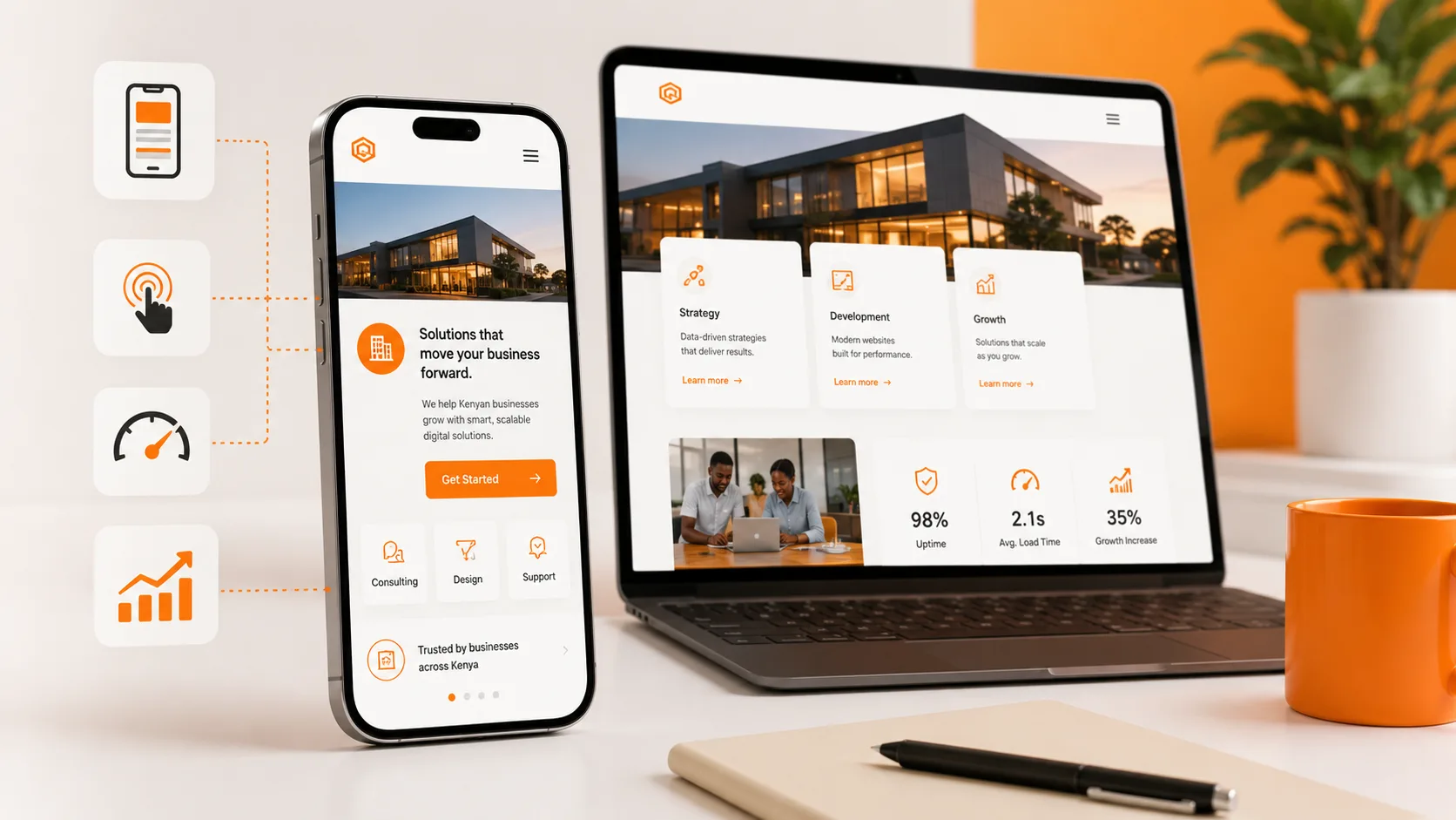
Ask yourself honestly: the last time you looked something up online — a business, a product, a service — was it on a laptop, or on your phone? For most people in Kenya today, the answer is almost always the phone.
Yet a surprising number of business websites are still designed with a desktop-first mindset, then squeezed onto mobile screens as an afterthought. The result is a slow, cramped, frustrating experience for the majority of visitors — at the exact moment they're deciding whether to trust your business. Here's why mobile-first design isn't a nice-to-have anymore. It's the baseline.
What Mobile-First Design Actually Means
Mobile-first design means building a website starting with the smallest screen first, then scaling up to tablets and desktops — rather than designing for a large desktop screen and shrinking it down afterward. This isn't just a technical detail; it fundamentally changes design decisions:
- Navigation menus are built to work with a thumb, not a mouse
- Content is prioritized so the most important information appears first, without excessive scrolling
- Images and page elements are sized and compressed for mobile data speeds
- Buttons and forms are large enough to tap accurately on a small screen
A responsive website that merely "adjusts" to smaller screens isn't the same thing — true mobile-first design starts with mobile constraints as the primary design driver, not a secondary adaptation.
Why This Matters So Much in Kenya Specifically
Mobile Is the Primary — Often Only — Internet Device
For a large share of Kenyan internet users, a smartphone isn't just their preferred device for browsing — it's their only device. Unlike markets where desktop browsing remains common in offices, mobile is frequently the sole entry point to the internet, which makes mobile performance a make-or-break factor rather than a secondary consideration.
Data Costs Make Speed Personal
Slow-loading, image-heavy websites don't just frustrate mobile users — they cost them money in mobile data. A bloated website that takes too long to load isn't just a UX problem; it's directly asking visitors to spend more of their data bundle just to see if your business is worth their time. Many will simply back out before the page finishes loading.
Local Search Happens on the Go
Searches like "restaurants near me," "plumber in Kikuyu," or "apartments for rent Kilimani" are overwhelmingly conducted on mobile devices, often while someone is already out and needs an answer quickly. A slow or clunky mobile experience at this exact moment of intent means losing a customer who was actively ready to act.
What Happens When Mobile Design Is an Afterthought
- Higher bounce rates — visitors leave within seconds of a page failing to load or display properly
- Lower search rankings — search engines factor mobile experience directly into ranking decisions
- Lost conversions — forms that are hard to fill, buttons that are hard to tap, and menus that don't open properly all quietly block potential customers from completing an action
- Damaged credibility — a broken or clunky mobile site signals a business that isn't paying attention to its own customer experience
What Good Mobile-First Design Looks Like in Practice
- Fast load times, even on slower mobile connections — achieved through image compression and efficient code, not by cutting corners on content
- Thumb-friendly navigation — menus, buttons, and forms sized and spaced for one-handed use
- Prioritized content — the most important information (what you offer, how to contact you, how to buy) appears immediately, without requiring extensive scrolling or pinching to zoom
- Click-to-call and click-to-WhatsApp buttons — since mobile users are far more likely to tap a button than manually dial a number or type an email
- Simplified forms — fewer fields, larger input boxes, and mobile-friendly keyboards (like numeric keypads for phone number fields)
Mobile-First Isn't Just for E-commerce
While online stores obviously benefit, mobile-first design matters just as much for service businesses, schools, churches, real estate companies, and professional services. Whether someone is looking up a law firm's contact details, checking a school's admission requirements, or browsing rental listings, the mobile experience is very often the deciding factor in whether they follow through.
Build Mobile-First with Blessedave Technologies
At Blessedave Technologies, every website we build starts with mobile design as the foundation — not an adjustment made after the fact. That means faster load times, easier navigation, and a better experience for the majority of your visitors who are browsing from a phone.
Get a mobile-friendliness review of your current website at blessedavetechnologies.com.